

Hackathon UI Design
A Dallas animal rescue’s brand and website needed a lot of love. Enter, my Hackathon Team…
Hackathon: Redesigning Cody’s Friends to Increase Pet Adoptions
A Dallas animal rescue’s brand and website needed a lot of love.
Enter, my Hackathon Team…
TL;DR
I redesigned and rebranded the Cody’s Friends website in The Big Give Dallas, 2018 - it was an amazing experience I want to repeat soon!
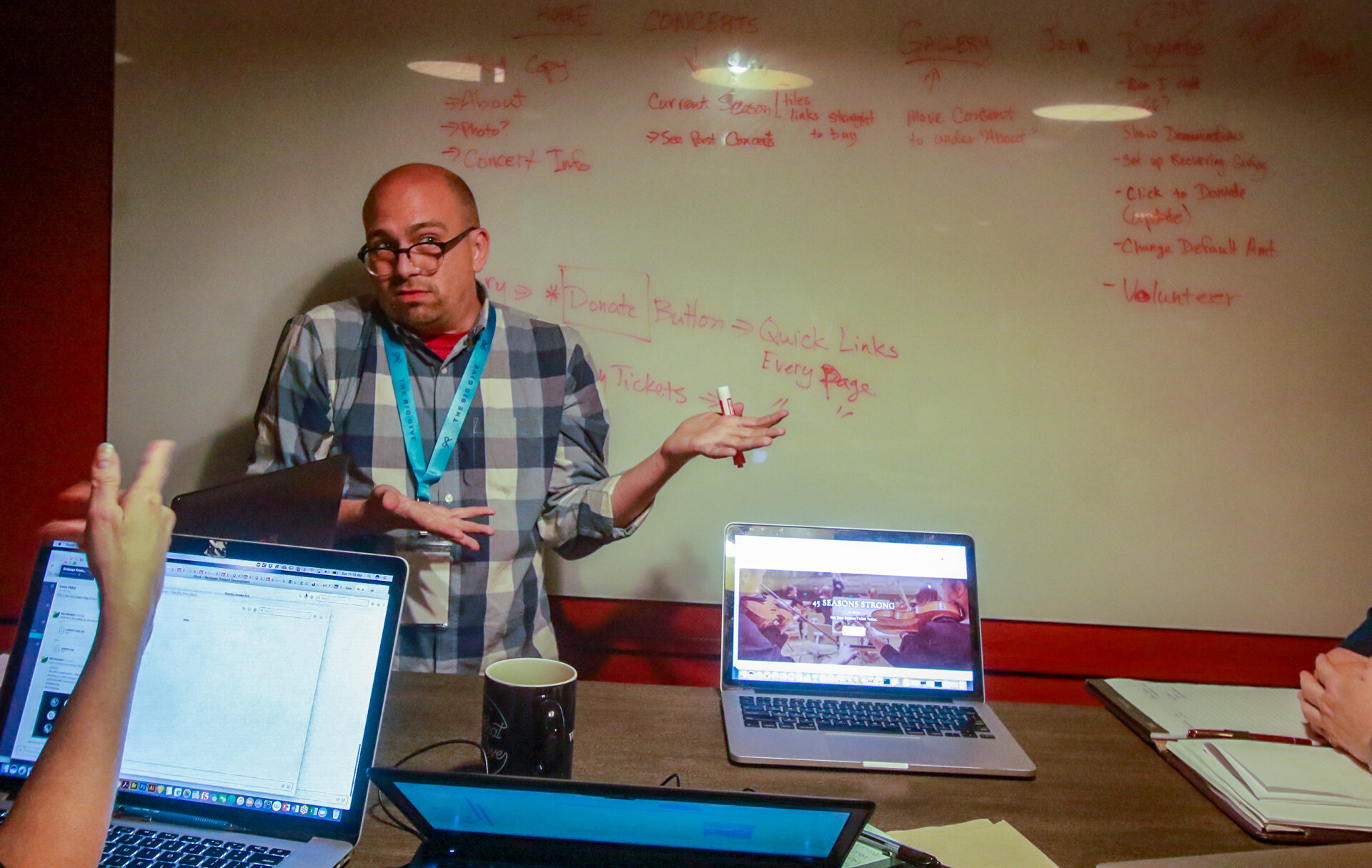
Event Photos


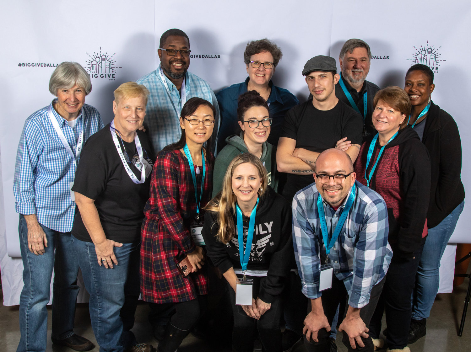


My team consisted of the following awesome people:
JD McLeod, Project Manager
Jen Blatz, Research/Design
Mia Lin, IA/Design/Branding
Jon Nguyen, UX/UI Design
Janelle Nichols, UX Architect
Riley Nipper, FED, UX/UI Design
Courtney Cox Wakefield, FED, UX/UI Design, Research
We divided the responsibilities the morning of the hackathon, and decided that I would be rebranding and redesigning the home page of the site. The original brand designer had to withdraw from the hackathon, but I volunteered to give it my best shot.
Participants
Creative Brief
Client Request
The wishlist for the organization was long and complex, and tended more toward forms, communication methods, and tracking of animals, which is core to their organization. A majority of the team worked on architecting, setting up, and coordinating those, so the design was all mine.
So the most beneficial thing for me would be a system that allows a single point of data entry that can export to the others, allow each foster to upload and enter their own information and records, and allow tools for the admins for oversight and alerts on upcoming due dates, missing records, past-due dates, last activity, etc. Needs to be very user-friendly as some fosters don't have a lot of experience and maybe working basically from their phone...
Project Manager Proposal
Social Media
New website
Creating forms for donors and fosters to keep up with info
Simplifying messages to execs and team leads
Maybe we create new spreadsheets and forms then also talk it over about using slack, discord or some other form of communication than facebook messenger or something of that sort.
Interview & Moodboard
Interview
I had ten minutes on the morning of the hackathon with Dan and Sharyl, the organization’s representatives, to get the answers to a few questions:
Who’s the decision-maker on the design for this project, and will be able to approve or collaborate today?
How attached are they to the current design/logo/voice?
What other sites do you respect, admire, or think are awesome in the pet/rescue space?
What words would you use to describe the feeling people should get when they see your website and social media?
Can you prioritize the site’s features you want (and want to keep) into 3 groups (greatest impact, moderate impact, least impact)?
Moodboard
Words that I keyed in on for this moodboard were
bright - a palette with bright colors that weren’t “the same as everyone else”
friendly & welcoming - pet people mostly meet the organization online, so they need to feel like this is an organization they want to work with
fun - the site should be “optimistic” and “fun”, with a playful vibe that helps adopters think of playing with the dogs
modern - the old branding is cartoonish and has a dated palette

Logo: Cold Nose, Warm Heart
I created a simple black-and-white wordmark for contrast (and flexibility in usage), and added a graphic smiling puppy face with a heart-like nose.
Typography
I chose Baloo, a Google font with a playful but thick and legible design that’s perfect for the wordmark. As a Google font, it’s free (important for non-profits), and embeddable in any website host they choose. It can also be downloaded and used in print and other collateral.
The body font of the site design is Open Sans, with spacious counters, more neutral aspect, and semi-geometric humanist lines. Also a Google font, it’s friendly and expansive, legible at smaller sizes, and suitable for body copy.
Color
I stuck to the moodboard’s palettes - I’d chosen them with warmth, vibrance, and the ability to pair well with animals of any color or coat style.

The Rebrand
Page Design
Header and Puplight
For the header, I wanted to minimize the navigation and maximize the puppiness. The logo and search box and primary navigation are there, but subtle and understated.
Making the header subtle allowed me to highlight a “problem pup”. Every rescue has a dog or dogs that take longer than average to adopt. They are usually large dogs of indeterminate breed, or dogs of a stigmatized breed like Rottweilers, Pit Bulls, and German Shepherds.
To give this pupper the extra attention they may need to get noticed or adopted, spotlighting the doggo brings them front and center to site visitors.

Petfinder Insert
Their primary method of listing doggies is through the Petfinder website, the greatest adoption-driver for rescues and shelters. To minimize the amount of effort to list dogs both on their website and in the Petfinder database, rescue orgs use Petfinder’s free API to insert the listings code into the org’s website. I kept the design of this insert clean to highlight the animals’ profile photos.
I made a suggestion of some attractive header copy, a personality-driven subheader per pet, as well as naming dogs rescued during the same month (week?) with names on a theme, like the Vancouver Aquarium does. Renaming the pets gives them a new lease on life, and keeps the org from having 20 different dogs with the same name. The name Arya is so popular right now; I volunteered at my vet’s office in Dallas, and there were four animals named Arya on my last visit (cats and dogs both!).

Adoption Successes Widget
In addition to highlighting the animals who need homes, I thought it would be heartwarming to celebrate some of the organization’s adoption successes! This will show nervous adoptees that pre-owned puppers can still be happy with a new family (a surprising concern I gathered from the founders).

This is an actual success story from the organization - it’s wonderful to highlight wins! And I can’t spell “successes”!
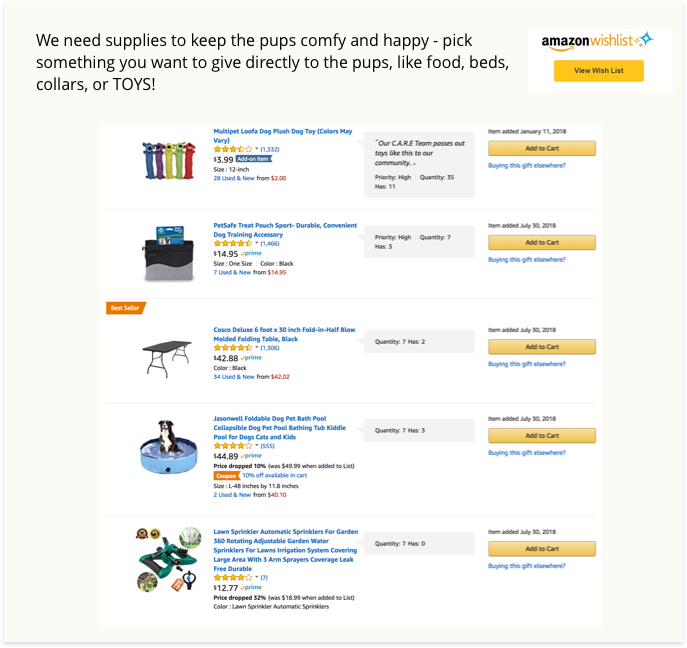
New Content: Amazon Insert
Amazon giving is a fast, painless way for visitors to assuage some of their guilt for not adopting immediately (I should know). Dallas Animal Services maintains their Amazon wishlist, and I’d given to it several times - directly giving warm blankies, stuffed toys, treats, or medicines to puppies (!!!!!) Suffice it to say, I donated WAY more when I was able to choose what I would be giving the animals instead of a cash donation.
I suggested this approach, and implemented it in the design as a way to get donations when people were hesitant to just give cash.
Calls To Action
The three primary calls-to-action for any organization are fostering/volunteering, events, and adoption. I made these buttons large, rounded and soft, and included a short explanation of what the user would get once they were clicked.

Adoption Events
Adoption events are less-often a call-to-action on rescue org’s sites, but are still very important to organizations. Rescue groups often rely on busy, high-traffic times and locations to attract people to their pets - after all, what’s more persuasive than big brown eyes looking right at you through the cage?

Instagram Insert
Cody’s uses Instagram often to advertise adoptable dogs, and in addition to the social links in the footer, I felt that it would be advantageous to include the efforts they put into their social presence on the website. No effort of a non-profit should be wasted; they have few resources as it is.

The dark footer grounds the bottom of the web page, and de-emphasizes it at the same time.
The Whole Shebang
I admit, I got choked up when I was presenting the design to Cody’s Friends. I’m a sucker for pets of any kind, and the tears of joy, gratitude, and amazement on Codys’ volunteers’ and founders’ faces really affected me.
I was disappointed that the development team wasn’t able to implement the design in time - too much effort was put into the much-needed systems design to be able to implement it.
The logo was added to their Instagram account, and I am in discussions with the board to see if we can find a way to get the site implemented, if not exactly like this, but in a similar way. I feel that if I can do that, I will have closed a very important karmic circle.

Header photo by Adam Griffith on Unsplash


